windows
Choosing the right colour for your windows and doors
Published 20 September 2026 by Steve Radford
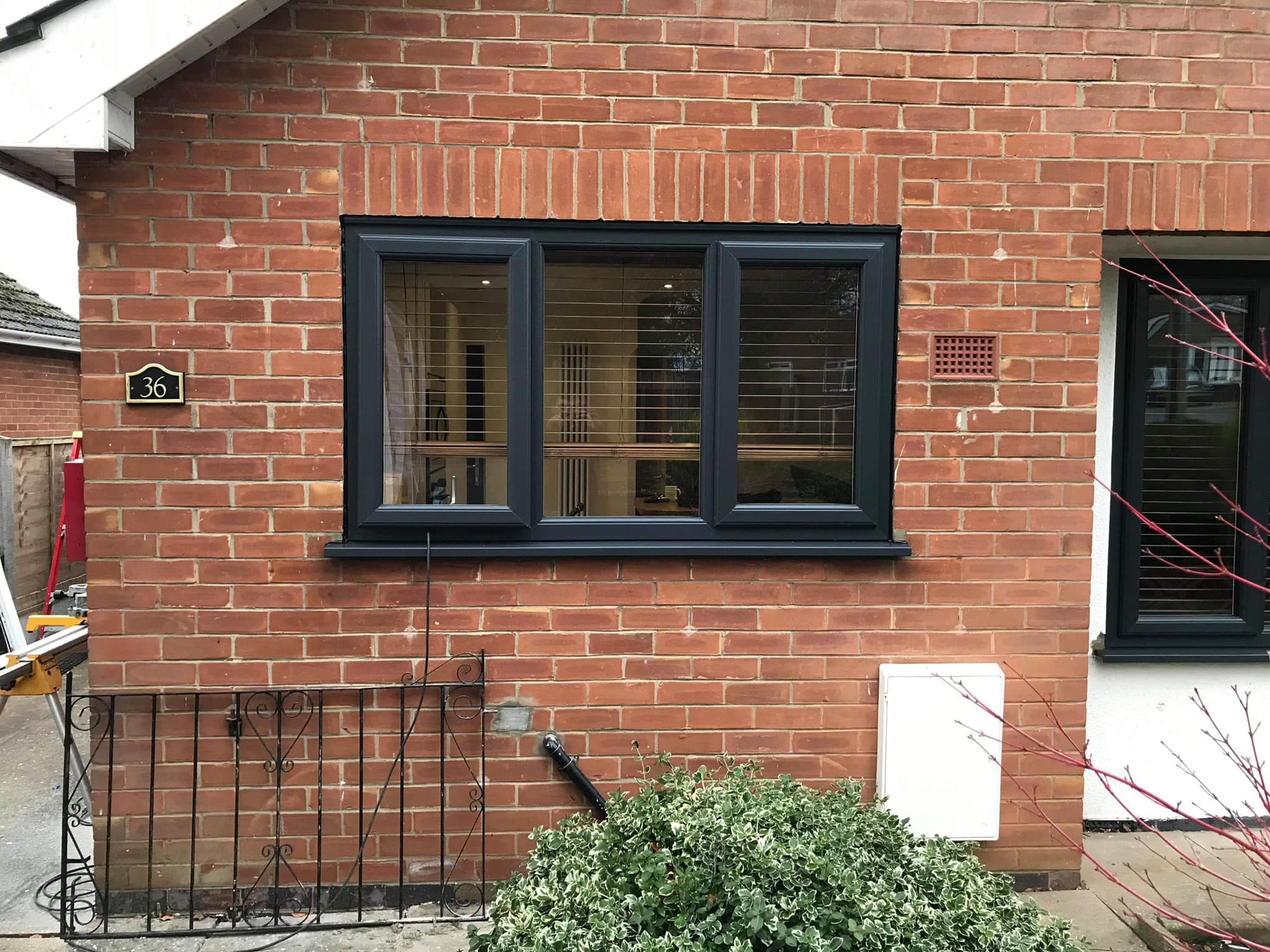
The colour that suits your house is decided by three things, and none of them is what is currently fashionable. What the walls are made of and what colour they are, how old the property is, and which way the frontage faces. Get those right and almost any colour works. Ignore them and even a beautiful colour can make a house look wrong in a way the owner struggles to name afterwards.
The other thing worth knowing before you start is that windows and doors are not the same decision. You will live with your window colour on every elevation for twenty years or more, so it wants to be quieter than you think. A front door is one object, easily changed later, and it can take a colour with real personality. Treating them as one choice is how people end up with a frontage that shouts.
Start with the walls, not the swatch
Hold a colour against your own brickwork or render in daylight before you commit to anything. This sounds obvious and almost nobody does it, because the sample card is in a showroom and the house is at home.
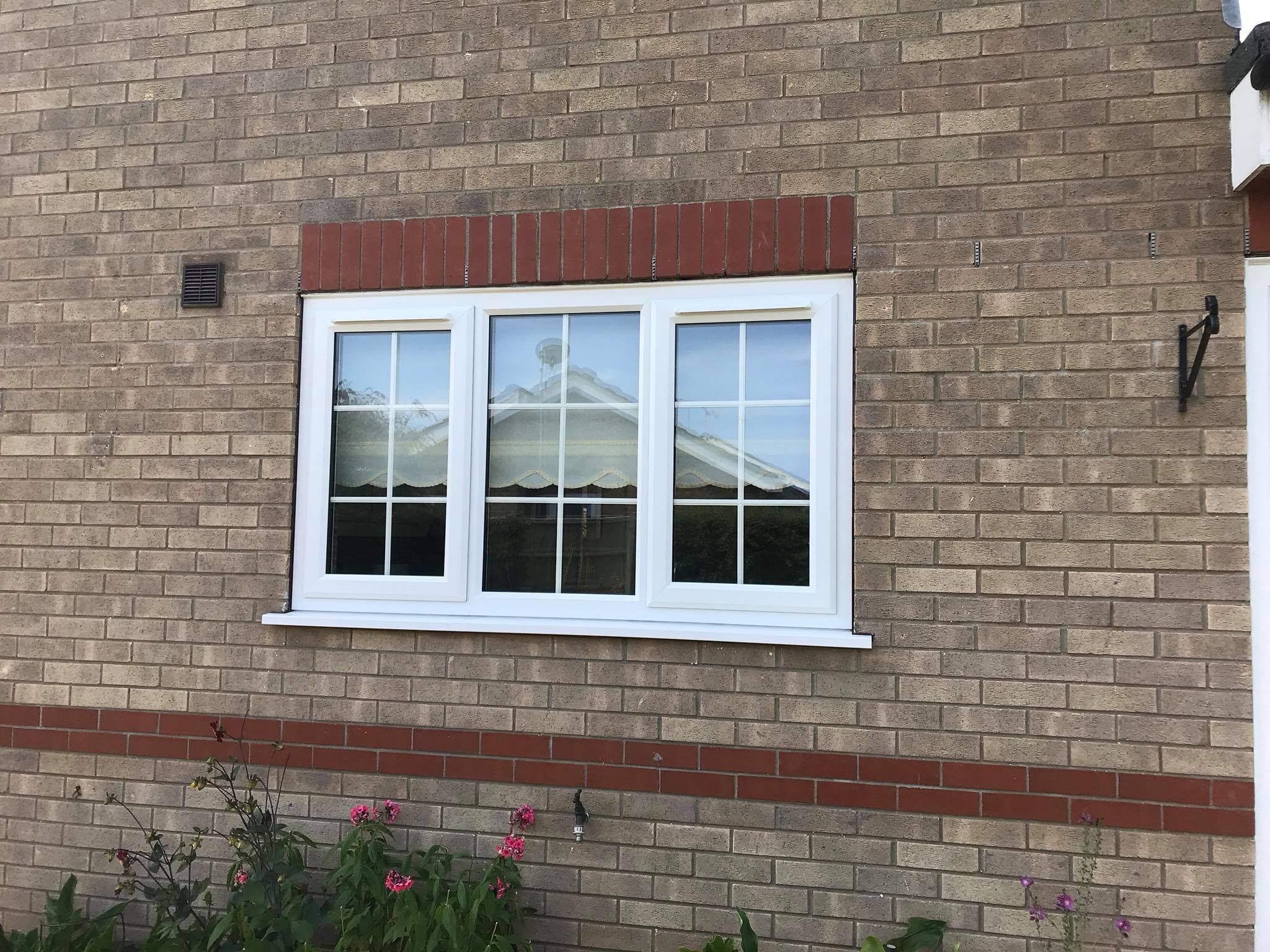
Red brick, which is most of this county's older stock, sits comfortably with creams, off whites, heritage greens and woodgrains, and can fight with a cool mid grey. Buff and yellow brick takes greys and greens well. Rendered and painted frontages, which are common along the coast, are the most forgiving of all because the render can be repainted to suit and often is. Modern estate brick, which tends to be flatter in tone, is where anthracite genuinely does look its best.
In our experience, choosing the colour against the house in daylight works better than choosing from a sample card indoors because showroom lighting flattens everything and the difference between two greys that look identical on a card is obvious on a wall at four in the afternoon. We would far rather leave samples with somebody for a few days than have them decide in twenty minutes.
Anthracite, and when it is not the answer
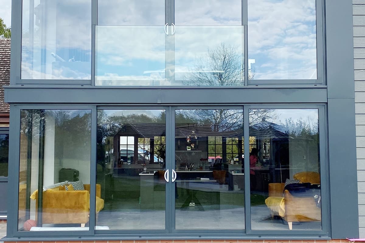
Anthracite grey has been the default modern window colour for years now, and there is a good reason for it. It is a deep neutral, it reads as contemporary without being loud, it makes the glass look bigger by putting a dark edge round it, and it works on almost every modern house.
Where it goes wrong is on older properties. On a Victorian villa or a stone cottage, a dark cool grey can look like a piece of modern hardware bolted into an old opening, particularly with a chunky frame. It is not that grey is wrong on old houses, it is that the warmer heritage greys, the greens and the woodgrains usually do the job better. Choosing windows for a period property is a whole subject of its own and it is set out in windows for older Lincolnshire homes.
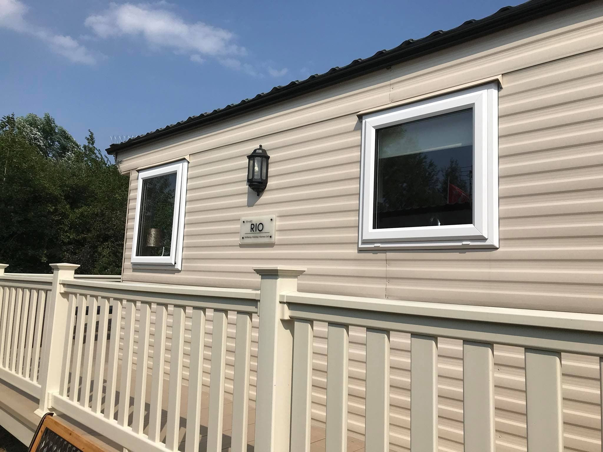
White is still the most popular colour we fit and there is nothing unadventurous about it. It is the most stable finish over time, it is usually the least expensive, and on a house with painted render or a strong front door it lets the other elements do the talking.
You can have different colours inside and out
This is the option most people do not know exists and it solves the most common objection we hear, which is that somebody wants a dark exterior but does not want dark frames looking into their living room.
Dual colour means a coloured or woodgrain foil on the outside and white on the inside. The outside gets the anthracite, the green or the oak effect, and the inside stays white, which keeps rooms feeling light and matches existing white trim without redecorating. It is a very common specification and it costs less than people expect.
The same applies to doors. A composite door can be one colour outside and white inside, which is worth knowing if you have set your heart on a deep blue or a dark green but the hallway is painted magnolia.
What the coast does to a finish
Two things happen here that do not happen inland, and both are worth factoring in.
The first is salt. Salt deposits dry to a pale film, and a pale film shows far more on a dark frame than a light one. An anthracite window on a seafront elevation will look dusty between cleans in a way a white one will not. That is entirely cosmetic and it rinses off with fresh water, but if you are somebody who will be irritated by it, it is better to know now than to discover it in January.
The second is sun. A dark foil on a south or west facing elevation absorbs a good deal more heat than a white one. Modern foils are made for this and it is not the problem it once was, but on a large expanse of glazing in full sun it is a real consideration and worth raising with whoever is specifying the job.
From fitting along this coast since 1983, our honest position is that neither of these should stop you choosing a dark colour. They should just be part of the conversation rather than a surprise afterwards.
Front doors can be braver
A front door is where colour is allowed to be a decision rather than a compromise. There is one of it, it is the thing people look at, and it is the cheapest element on the house to change your mind about in ten years.
Deep blues, greens, burgundies and blacks all work on traditional frontages here, and the more contemporary greys and greens sit well on newer houses. The things worth thinking about are whether the colour suits the porch or reveal it sits inside, whether it fights with the roof tiles, and how the hardware finish reads against it, because chrome, brushed steel, black and antique brass all change the character of the same door completely. The wider case for the material itself is in the benefits of a composite front door.
One practical note. If you are doing windows and a door at the same time, they do not have to match, and often they should not. A white window with a bold door is a classic combination. Matching everything to one colour is what makes a frontage look flat.
What to actually do next
Narrow it to two or three, get samples, and put them against your own house at different times of day. Look at what your neighbours have, not to copy it but to see how each colour behaves on the same brick in the same light. Decide the outside and the inside separately. And check what the finish actually is, because a foiled finish, a woodgrain and a solid colour all age differently.
The full range of colours and finishes for both windows and doors is in the windows brochures and the doors brochures, including the colour guide that covers both profiles. There are also a good many finished examples in our window gallery and door gallery, which is more useful than any swatch because you are seeing them on real houses in this area rather than on a card.
The short version
Choose against your own walls in daylight. Let the age of the house steer you. Keep windows quieter than doors. Use dual colour if you want dark outside and light inside. Expect a dark finish to show salt on a coastal frontage. And do not feel obliged to match everything.
If you would like somebody to bring samples and hold them up against your house, that is a normal part of what we do rather than a favour. Piper Windows has been choosing colours with people on these streets since 1983. Get a free no-obligation quote or ring us on 01754 898 998.
Thinking about new windows, doors or a conservatory? Request a free no obligation quote or call us on 01754 898 998.